


AVANT LA LETTRE: An unknown, early smile ahead of fancy typography
By Philippe Blanc
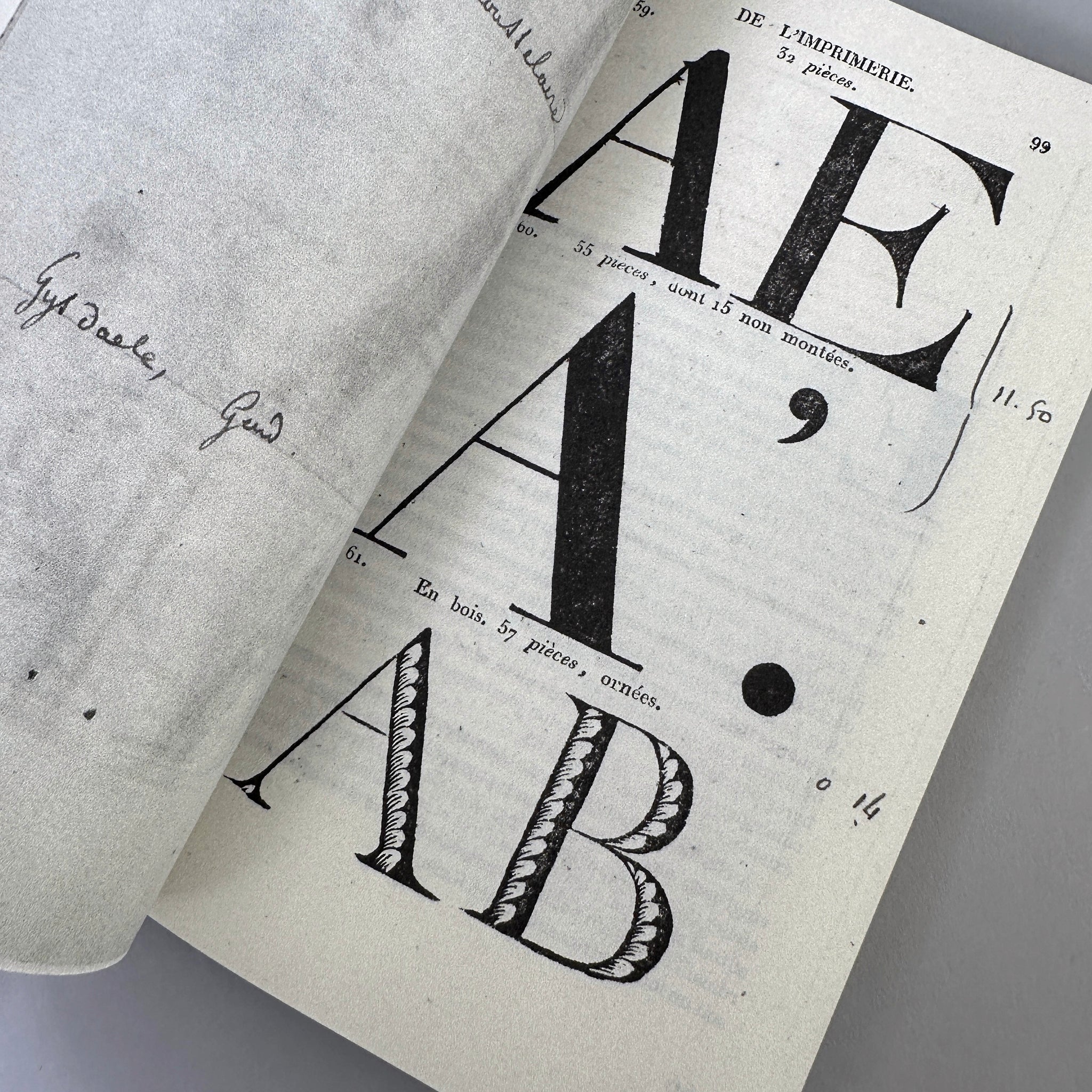
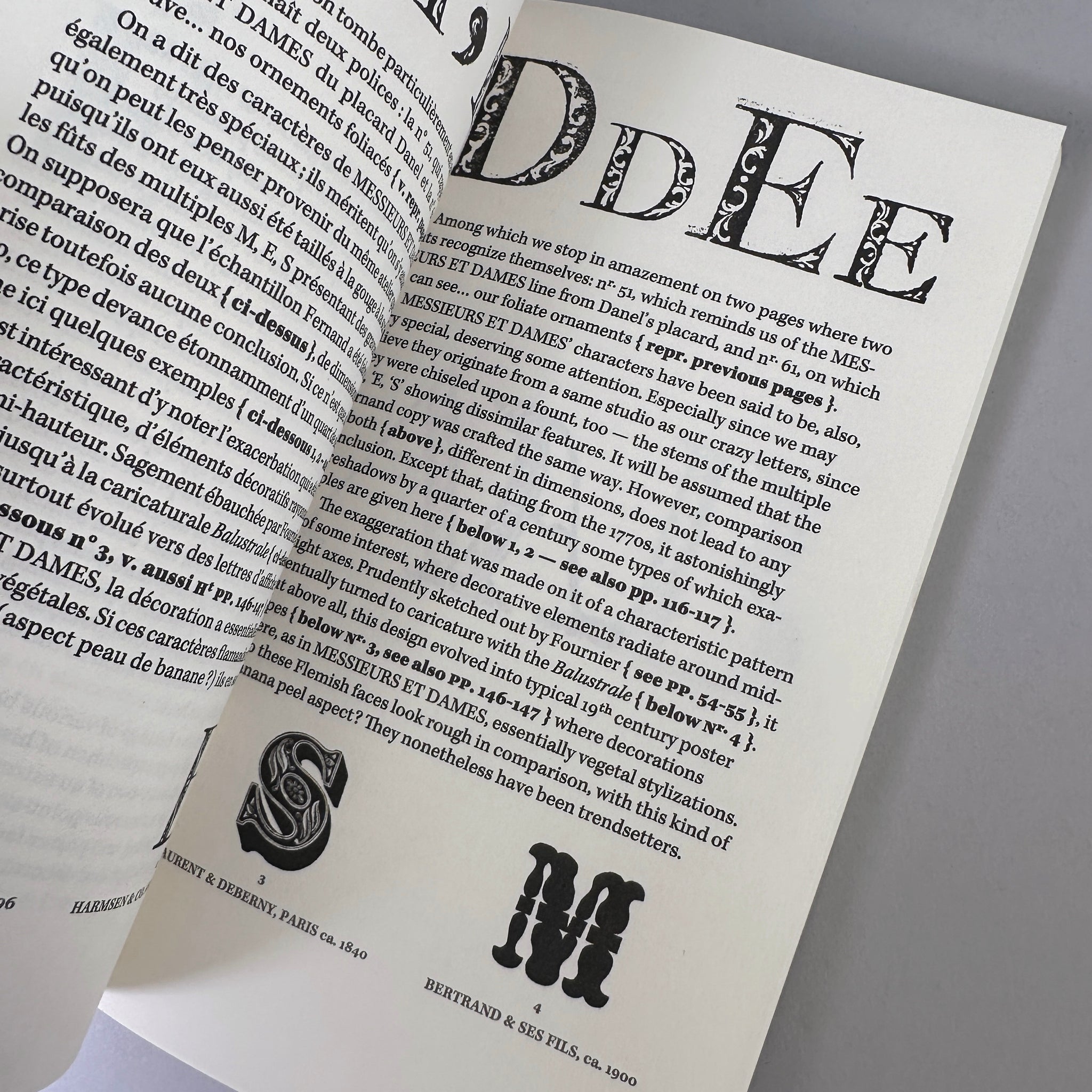
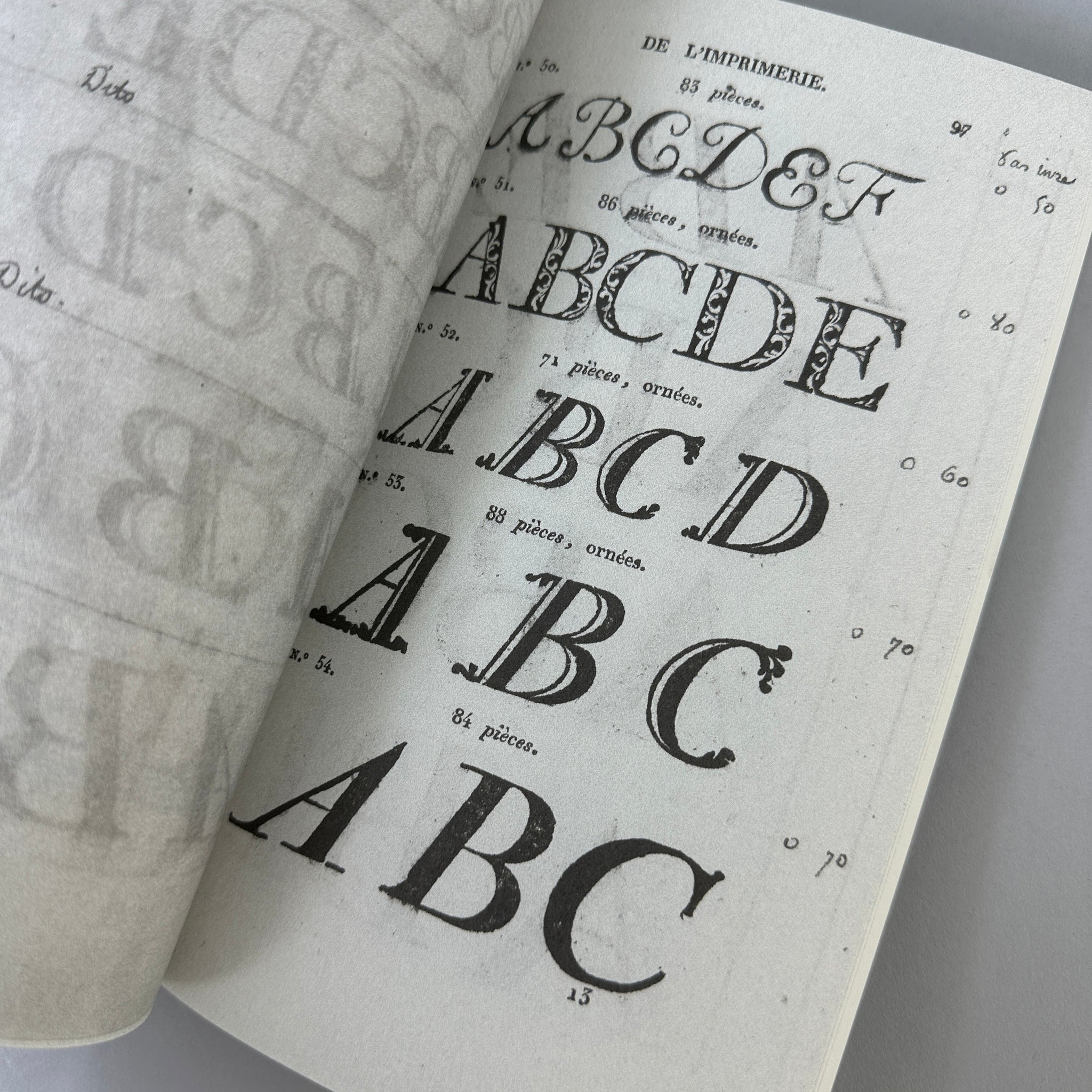
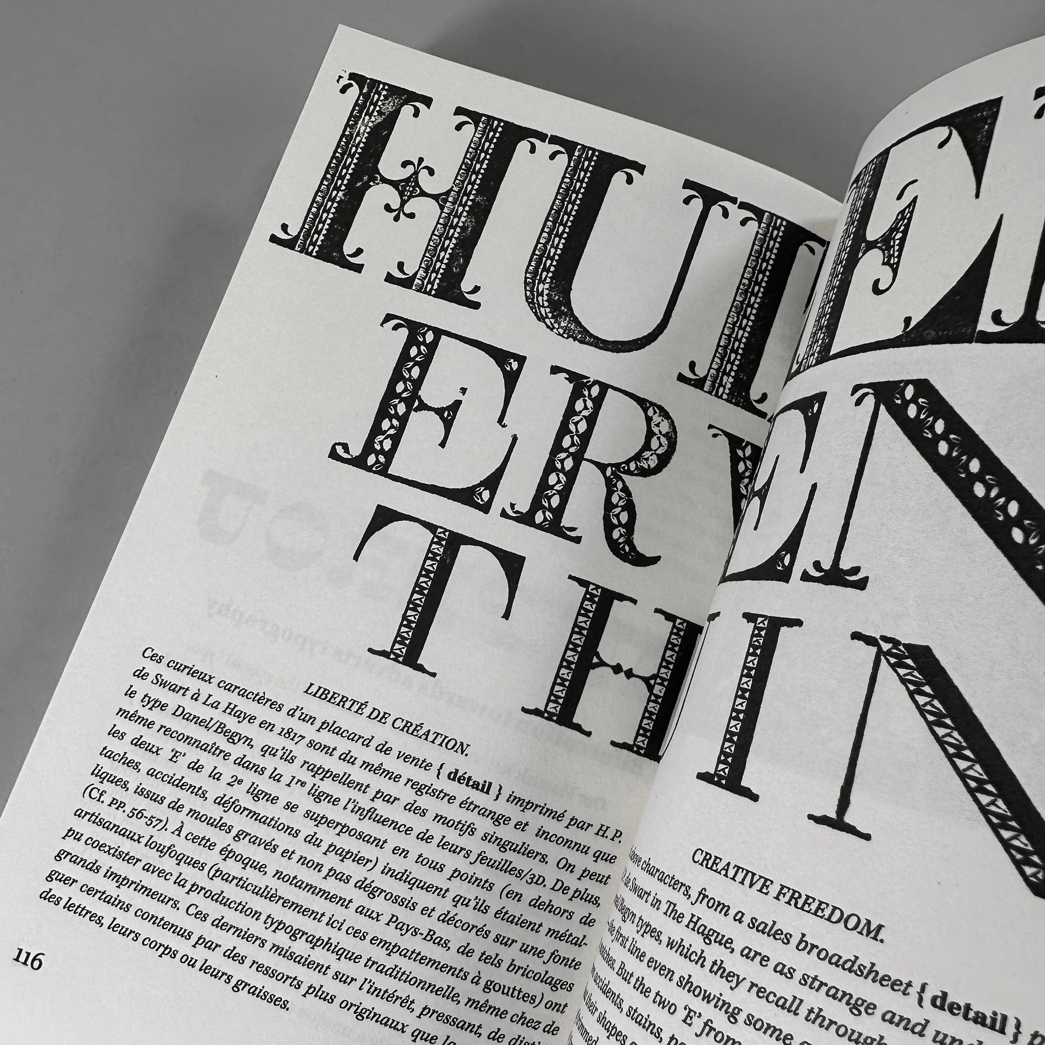
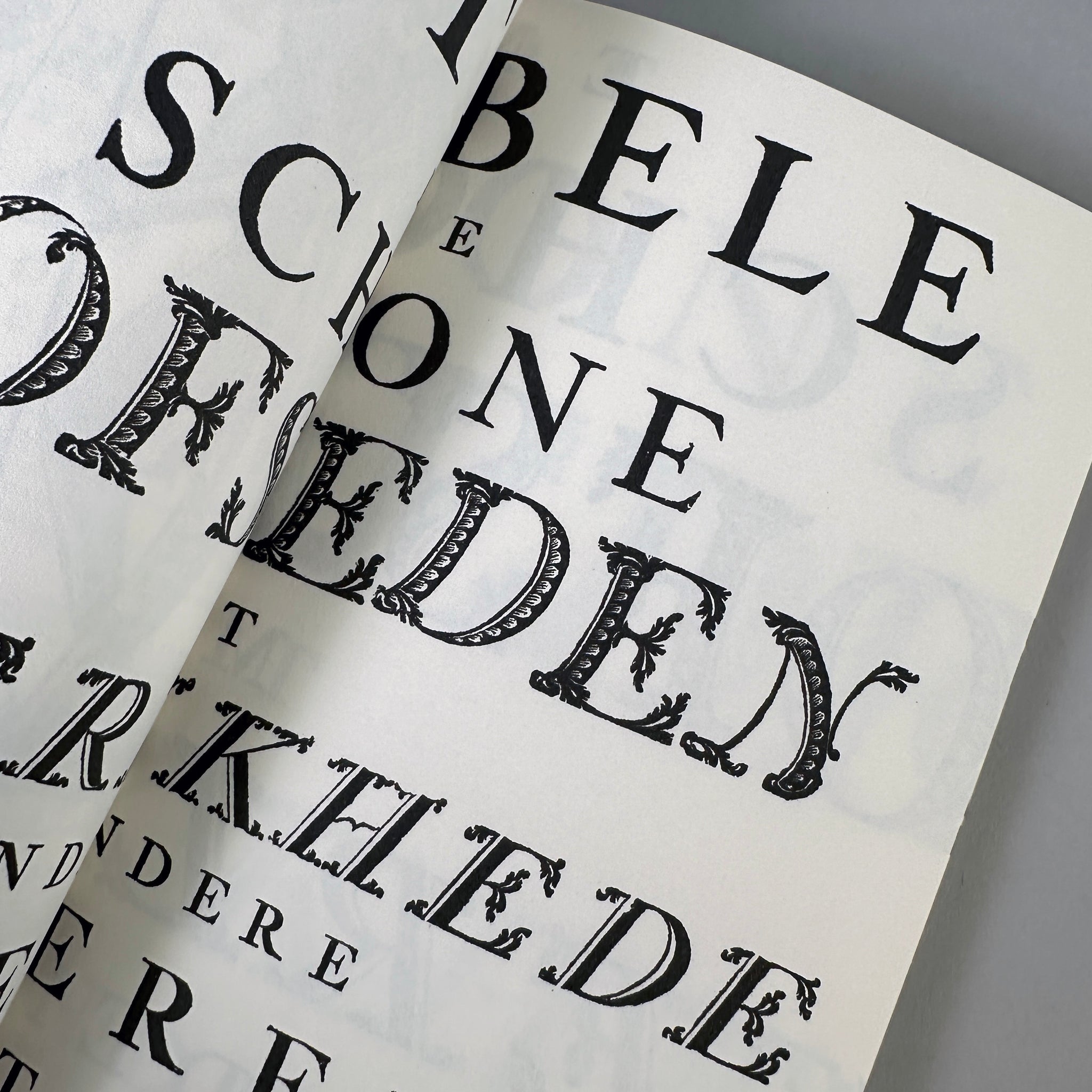
A typeface which had surprisingly remained ignored until now has recently resurfaced at auctions’ random, on two antique posters. It is a large, somewhat quirky 18th century character that was used in Flanders. It can’t be found in any specimens or essays, although it may be considered predecessor to many graphic audacities that have followed. While its design did not match any standard of the time, it supplies evidence supporting the eruption of “fancy” faces in typography, when this hitherto conformist profession conceded creative freedom to meet a boom in advertising.
Published by Fontegrâce, 2023
Bilingual, in French and English
Printed in a limited edition of 180 copies
Softcover, 160 pages, printed in black on an ink-jet digital rotary press, 4.9 × 8.2 inches
ISBN: 978–2‑95-875111‑1